Opinion
Why AI-Generated Websites All Look the Same (And How to Avoid It)
The purple gradient, the centred hero, the three-column feature grid. Why AI design tools converge on one look, and the specific prompting changes that break the pattern.
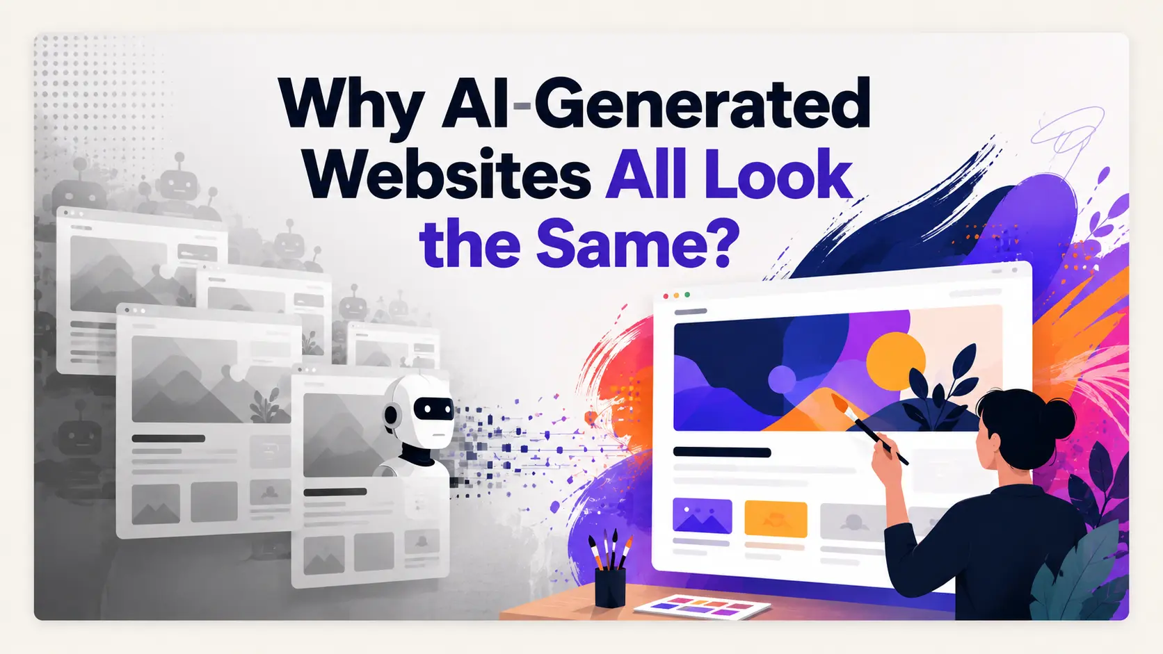
You can identify an AI-generated landing page in about two seconds, and so can your visitors. Centred hero with a gradient behind it. A headline in the same weight everyone uses. Three feature cards with rounded corners and a small icon at the top of each. A logo strip labelled "trusted by". Glassmorphism somewhere. A dark section near the bottom with a call to action reversed out of it.
It is not that any of those elements is bad. It is that all of them together, in that order, has become a signature. And a page that signals "generated in four minutes" is doing the opposite of what a landing page is for, which is to make a company look like it can be trusted with money.
The interesting question is why this happens so consistently across tools built by different teams on different models. The answer is structural, and once you see it the fix is fairly obvious.
Cause one: you asked for the average
"Make it modern and clean" feels like a design brief. It is not. It contains no information a model can act on differently from any other request, which means the most probable output is the centre of the distribution: the design most like all the designs it has seen.
And the training distribution for SaaS landing pages is extremely concentrated. A decade of startups copying each other's homepages produced a genre with a fixed structure. When you ask for the average of that genre, you get the genre.
Most AI-generated websites look exactly like what they are: AI-generated.
A recurring complaint across 2026 tool reviews
This is why the sameness is not really a model quality problem. A better model asked for "modern and clean" produces a more polished average, not a more distinctive one.
Cause two: models are tuned to be safe
Generation systems are optimised so that most outputs are acceptable. That objective quietly penalises distinctiveness, because distinctive choices are higher variance. A design with an unusual typographic scale or an aggressive colour is either excellent or a failure, and a system judged on average satisfaction learns to avoid it.
The result is output that is competent and forgettable, which for a landing page is close to the worst possible outcome. Nobody dislikes it. Nobody remembers it either.
Cause three: defaults compound
Underneath most generated pages sits the same component vocabulary: the same utility framework, the same component library, the same default border radius, the same default shadow, the same spacing scale. Those defaults exist because they are good, and they are good because they are widely adopted, and wide adoption is exactly the problem.
Two tools built by unrelated teams, using the same component library at its default settings, produce pages that are cousins. Nobody chose that. It fell out of the stack.
Cause four: no point of view
A human designer makes decisions a model does not: what to leave out, where to break rhythm, which single element earns emphasis at the cost of everything around it. Those decisions come from a point of view about the product and its audience.
A generation system with no point of view applies the same treatment evenly. Every section gets the same padding. Every heading gets the same weight. Which is why generated pages so often feel flat even when every individual element is well made. Uniformity reads as absence of intent.
Four fixes that actually work
None of these require a different tool. They work on v0, Lovable, Bolt, ResetUI, and everything else in the category, because the problem is the brief rather than the engine.
1. Commit to a named design direction
Not "modern". A direction is a specific aesthetic tradition with consequences you can name. Some that work for SaaS:
- Editorial. Serif headlines, generous measure, asymmetric layout, restrained colour. Reads as considered and confident.
- Technical. Monospace accents, dense information, visible structure, borders rather than shadows. Right for developer tools.
- Minimal. Very few elements, a lot of space, one accent colour. Requires strong copy because there is nothing to hide behind.
- Brutalist. Hard edges, heavy type, high contrast, no rounded corners. Memorable and polarising.
- Warm. Off-white grounds, muted earth tones, softer type. Reads human rather than corporate.
The specific choice matters far less than making one. Any of these produces something with a point of view. "Modern and clean" produces the genre.
2. Constrain colour and type explicitly
Left open, generators reach for gradients because gradients are visually busy in a way that reads as effort. Name one accent colour and forbid gradients and you have removed the single most recognisable AI tell.
Same with type. Naming a specific pairing, or even just "one typeface, two weights", forces decisions that default settings would make for you.
3. Specify structure, not just style
Most sameness is structural rather than visual. The hero, the three features, the logos, the testimonial, the pricing, the closing CTA, in that order. Change the order and the page stops reading as generated even before you touch the styling.
Put the proof next to the call to action rather than in its own section. Testing across roughly 2,000 landing pages found that moving a testimonial adjacent to the primary CTA produced a 68% conversion lift on B2B SaaS pages, so this is not only a distinctiveness argument.
4. Use your real copy
Placeholder text produces layouts sized for text you will never use. Every heading is conveniently six words. Every feature description is conveniently two lines. Then you paste in your actual copy, where one feature needs four lines and another needs one, and the balance falls apart.
This is one practical argument for redesign tools over from-scratch builders: a tool that reads your live page is working with your real copy from the start. The category difference is covered in redesign or rebuild.
Pick a direction rather than accepting the average
ResetUI generates from curated editorial, technical, minimal, and brutalist directions instead of one house style. No purple gradients by default.
See the directionsWhat the industry is doing about it
The encouraging sign is that vendors have recognised this as a product problem rather than a user problem.
v0 now ships named design systems, complete visual frameworks that control typography, spacing, components, and aesthetic as a coherent unit, rather than leaving the model to average. Reviewers note that generations made under these presets have a coherence and personality that standard prompting does not produce.
ResetUI takes the same position from a different angle: rather than one house style, generations draw from a curated library of editorial, technical, minimalist, and brutalist directions, and the direction is a required input rather than an optional one. Same underlying idea, which is that the fix for averaging is forcing a choice.
Expect more of this. The differentiator in AI design tooling is shifting from raw generation quality, where everyone is converging, to how well a tool lets you express and hold a specific point of view.
Does any of this actually matter?
A fair objection: if the page converts, who cares whether it looks like other pages?
Two answers. First, for most of the funnel it genuinely does not matter, and obsessing over distinctiveness at the expense of clarity is a real failure mode. A generic page that explains the product beats a distinctive page that does not.
Second, it matters at the specific moment when someone is comparing you against two competitors in adjacent tabs. If all three pages look assembled from the same kit, the visitor has no basis to believe any of you is more capable than the others, and defaults to price. Distinctiveness is not decoration at that moment. It is the only signal available.
The practical position: get clarity right first, then make the page look like it came from somewhere. The landing page redesign guide covers the clarity half in order.
Frequently asked questions
Why do AI-generated websites all look the same?
Because a vague prompt asks for the statistical average of the pages a model was trained on, and the training distribution for SaaS landing pages is highly concentrated: centred hero, gradient background, three-column feature grid, logo strip, dark CTA section. Shared component libraries and their default settings compound the effect, so tools built by unrelated teams produce similar output.
How do I stop my AI-generated landing page looking generic?
Four changes work regardless of tool. Name a specific design direction such as editorial, technical, minimal, or brutalist rather than asking for modern and clean. Constrain the palette to one accent colour and forbid gradients. Specify the section order rather than accepting the default. And supply your real copy instead of placeholder text, so the layout is sized for what you will actually publish.
Is the generic AI look a problem with the model or the prompt?
Mostly the prompt. A better model asked for something modern and clean produces a more polished average, not a more distinctive result. Generation systems are also tuned so most outputs are acceptable, which quietly penalises high-variance distinctive choices, so the safe default is baked in at both ends.
Do AI design tools have a fix for this?
Some do. v0 ships named design systems that control typography, spacing, and components as a coherent package rather than leaving the model to average, and reviewers report that generations under those presets have noticeably more personality. ResetUI takes a similar approach by making a curated design direction a required input rather than an optional one.
Does a distinctive landing page actually convert better?
Not on its own, and clarity matters more for most of the funnel. Distinctiveness matters at the specific moment a visitor is comparing you against competitors in adjacent tabs: if every page looks assembled from the same kit, there is no signal that one company is more capable than another and the decision defaults to price.
See it on your own landing page.
ResetUI reads your existing page, keeps your copy and brand, and rebuilds it in a design direction you pick. Free to start, and you own the code you export.
Redesign my page