Guides
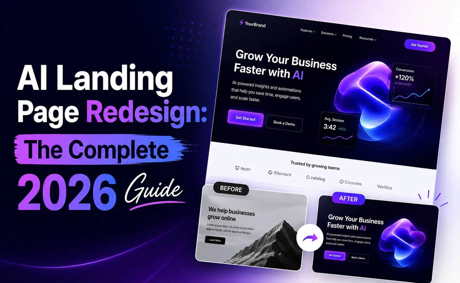
AI Landing Page Redesign: The Complete 2026 Guide
How to redesign a SaaS landing page with AI in 2026: what to change first, what it costs, what the conversion data says, and the mistakes that undo the work.
Most landing page redesigns fail in a specific and avoidable way. Someone decides the page looks dated, commissions a new one, ships it, and conversion stays flat or drops. The design changed. The reasons people were not converting did not.
AI has made the production step almost free, which is genuinely useful and also slightly dangerous. When generating a new page costs a few minutes, the temptation is to skip the thinking. This guide is mostly about the thinking, because the generating part is now the easy half.
Should you redesign at all?
Redesign when the page misrepresents the product, when the design actively undermines trust, or when the structure fights the visitor. Do not redesign because you are bored of it. You look at your landing page a hundred times more often than any visitor does, and the fatigue you feel is not a signal about their experience.
Concrete reasons to redesign, in rough order of how much they matter:
- The product changed and the page still describes the old one. This is the strongest reason and the most common.
- The page loads slowly or breaks on mobile. Fix this before anything cosmetic.
- Visitors cannot tell what the product does within about five seconds of landing.
- The design signals a smaller or less credible company than you actually are.
- You have several competing calls to action and no clear primary one.
If none of those apply, your problem is probably traffic or targeting rather than design, and a redesign will not touch it.
What the conversion data actually says
Before deciding what to change, it helps to know which changes tend to move numbers. A study that A/B tested roughly 2,000 landing pages across B2B SaaS, agencies, ecommerce, and lead generation between late 2025 and early 2026 produced some unusually clear findings.
68%
conversion lift from moving a testimonial next to the primary CTA on B2B SaaS pages
13.5% vs 10.5%
conversion for single-CTA pages versus pages with multiple competing CTAs
3.8% to 7.6%
form submissions after cutting a lead form from 11 fields to 4
Read those three together and a pattern emerges that has almost nothing to do with aesthetics. The wins came from simplification and from placing proof where the decision happens. None of them required a new visual identity.
Step 1: audit the page you have
Twenty minutes here saves the whole project. Open your landing page and answer these in writing.
- 01What does a stranger think this product does, based only on the headline and the first screen? Ask someone who does not work with you.
- 02What is the single action you want them to take? If you name more than one, that is the first thing to fix.
- 03Where does proof appear, and is it anywhere near the action you want taken?
- 04Which sections exist because they earn their place, and which exist because every SaaS page has them?
- 05What does your analytics say about where people leave? Scroll depth and exit rate per section beat opinion.
Keep the answers. They become the prompt later, which is the part most people improvise and then wonder why the output is generic.
Step 2: choose a design direction before you generate
This is the step that separates a redesign that looks considered from one that looks generated. An AI tool given no direction will produce the statistical average of every landing page it has seen, which is why so much generated work converges on the same gradient hero and the same three-column feature grid.
A design direction is a specific, committed answer to how the page should feel. Editorial and typographic. Technical and dense, like developer documentation. Minimal and quiet with a lot of whitespace. Brutalist and high contrast. Warm and human. The specific choice matters less than making one.
Pick by looking at who you sell to. A developer tool and a design agency should not look alike. If your output keeps coming back looking like everyone else's, this breakdown of why that happens covers the causes and the fixes.
Step 3: generate the redesign
Here is where tool choice matters. There are two categories and picking the wrong one costs days.
| Approach | What it does | Use when |
|---|---|---|
| URL-based redesign | Reads your live page, extracts copy, structure, and brand, rebuilds the design around them | You have a page and want to keep its content |
| Prompt-based builder | Generates something new from a text description with no knowledge of your site | You are building a page that does not exist yet |
ResetUI sits in the first category and is built specifically for SaaS landing pages: you paste the URL, describe the direction, and it generates a full redesign using your existing copy and brand. The wider field is compared in the 12 best AI website redesign tools, and the category distinction is explained in more depth in redesign or rebuild.
Whatever you use, write a real prompt. "Make it modern" produces the average. "Editorial layout, generous whitespace, serif headlines, single accent colour, testimonial directly above the signup form" produces something specific. Your audit notes are the raw material.
Run this on your own page
Paste your URL, describe the direction, and see the rebuild with your own copy in place. Free to start.
Redesign my landing pageStep 4: review the output honestly
Generated pages have a consistent set of weaknesses. Check for these specifically, because they are easy to miss when you are pleased that something appeared at all.
- Spacing rhythm. The most frequent complaint about AI-generated layouts is that vertical spacing is uniform where it should vary. Sections that deserve emphasis get the same padding as sections that do not.
- Hierarchy on the first screen. One headline, one supporting line, one action. If three things compete for attention, none wins.
- Proof placement. Testimonials at the bottom of the page are decoration. Testimonials next to the CTA are evidence.
- Copy that was silently rewritten. If the tool rewrote your headline, check that it still says what your product does. Generated copy trends toward the vague.
- Mobile. Most generation happens against a desktop layout. Look at the phone view before you ship anything.
Step 5: ship without losing your rankings
This is the step people skip and then regret. A redesign can undo years of SEO in an afternoon.
- 01Keep your URLs. If you must change one, redirect the old one with a 301.
- 02Keep your H1 and your heading structure. If the old page ranked for something, its headings are part of why.
- 03Carry over title tags, meta descriptions, and canonical tags rather than letting a new template generate fresh ones.
- 04Keep your structured data. If the old page had FAQ or product schema, the new one needs it too.
- 05Check page speed after launch. A prettier page that loads a second slower can convert worse despite looking better.
- 06Screenshot the old page and record its conversion rate before you replace it. You cannot evaluate the new one without a baseline.
Step 6: measure, then iterate
Give it enough traffic to mean something. A redesign that looks better and converts 0.3 points worse is a real outcome you need to be able to detect, and you cannot detect it on 200 sessions.
The advantage AI genuinely gives you here is not the first redesign. It is the second and third. When generating a variant costs minutes, running a real test between two directions becomes practical for a team that could never have afforded to design two pages.
What it costs
The gap is large enough to change what is possible for a small team.
| Route | Cost | Timeline |
|---|---|---|
| Design agency | $25,000 to $80,000 | 2 to 6 months |
| Freelance designer plus developer | $3,000 to $15,000 | 3 to 8 weeks |
| AI redesign tool | $0 to $200 | Minutes to a few days |
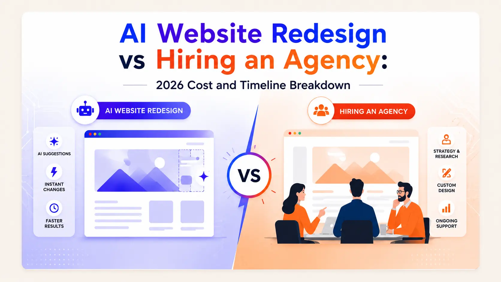
The tradeoff is strategy rather than execution. An agency will challenge your positioning. An AI tool executes the direction you give it, which is why the audit step matters so much. The full breakdown is in AI redesign versus hiring an agency.
The five mistakes that waste the effort
- 01Redesigning without writing down what problem the redesign solves.
- 02Using a from-scratch builder for a redesign, then spending two days pasting your own copy back in.
- 03Accepting the first generation. The second prompt, informed by what was wrong with the first, is almost always better.
- 04Shipping without redirects, keeping headings, or carrying over metadata.
- 05Never measuring, so you never learn whether it worked.
Frequently asked questions
How long does an AI landing page redesign take?
The generation itself takes minutes. The whole project, done properly, takes a few days: an hour to audit the current page, minutes to generate and regenerate, then a review pass and a careful launch that preserves URLs and metadata. Compare that with two to six months for a typical agency redesign.
Will an AI redesign improve my conversion rate?
Only if it fixes the reason people were not converting. Testing across roughly 2,000 landing pages found the biggest wins came from simplification and proof placement, not visual style: moving a testimonial next to the CTA produced a 68% lift, and single-CTA pages converted at 13.5% versus 10.5% for pages with competing CTAs. A redesign that changes the look but not the structure usually does not move much.
Do I need to rewrite my copy for an AI redesign?
Not if you use a tool that reads your existing page. URL-based redesign tools extract your current copy and rebuild the design around it, which preserves whatever SEO value that text carries. Prompt-based builders generate new copy, and generated copy trends toward the vague, so check it against what your product actually does.
Can an AI redesign hurt my SEO?
Yes, if you change URLs without redirects, drop your heading structure, lose your title tags and meta descriptions, or remove structured data. None of that is inherent to AI redesign, it is just what happens when any new page replaces an old one carelessly. Keep URLs, headings, metadata, and schema intact and the risk is small.
What should I change first on a SaaS landing page?
Make sure a stranger can tell what the product does from the first screen, reduce to a single primary call to action, and move your strongest piece of proof next to that action. Those three changes are structural, take less effort than a full visual redesign, and the testing data suggests they carry most of the conversion gain.
See it on your own landing page.
ResetUI reads your existing page, keeps your copy and brand, and rebuilds it in a design direction you pick. Free to start, and you own the code you export.
Redesign my page